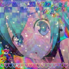
In my Ambiguity Studios Icon, I believe I was successful in achieving unity due to it being cohesive and pulling itself together. To achieve this, I heavily used repetition and only used 5-8 colors to keep the pallet simple. I also used a center alignment so everything, even if uneven itself, points and directs to the middle. Shape pulls a lot of the unity together with the circle’s radius, the points of the hearts and the middle of the blades directing to the radius.
☆.。.:* LazyL3m0n3z *.。.:*☆